I like the idea that a feeling could have a color before it has a proper explanation. There are days when “fine” seems like a remarkably lazy description of everything happening inside a person, although I understand why we use it. Trying to explain that you're hopeful, tired, slightly irritated and excited about something completely unrelated can turn a casual conversation into a considerably longer commitment than anybody intended.
Maybe this is the sommelier in me getting involved again. We borrow words from all over the place to describe wine, including texture, personality and things that sound suspiciously like moods. A wine can seem cheerful or brooding, and somehow that communicates something. So I started wondering what would happen if we gave our feelings a palette too, with red for urgency, green for growth, blue for a little emotional breathing room, and whatever strange combination fits everything happening between them.
That's what I mean by a chromatic theory of feeling here, my own way of thinking about emotions through color. The psychology research gives us interesting connections to work with, while the particular meanings remain open to our experiences. Calling a feeling violet is a metaphor; it doesn't mean the feeling is producing violet light inside our bodies. Although an emotional paint sample would probably be easier to carry around than the explanation.
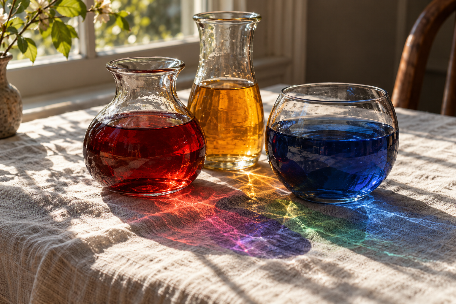
There Really Is Research Behind These Color Connections
In a 2020 study involving 4,598 people from 30 nations, researchers asked participants to connect 12 color terms with 20 emotion concepts. The overall patterns had a great deal in common across countries, which is pretty interesting considering the different languages and places involved. At the same time, associations were more alike between countries that were geographically or linguistically closer.
So we have shared tendencies alongside local differences, which feels considerably more believable to me than the idea that everybody carries around an identical emotional color chart. Language, surroundings and the things we learn can all be part of the picture. That study measured the connections people made between ideas; it gives us a starting point for understanding those connections, rather than a recipe for producing an emotion with a paint color.
A 2025 systematic review brought together 132 papers covering 42,266 participants from 64 countries. Its central finding was wonderfully messy, with colors often linked to several emotions and emotions linked to several colors. Lightness and vividness mattered alongside hue. That leaves considerably more room for an actual person than a chart announcing that yellow means happy and everybody should please cooperate.
Synesthesia Is Its Own Fascinating Thing
There are people for whom color connections arrive as part of a recurring perceptual experience. In grapheme-color synesthesia, for example, letters or numbers can have particular colors, and those pairings can be strikingly consistent. A study of 15 people with this form of synesthesia examined those individual, reliable connections. The colors belong to the person's experience, so two people can have very different opinions about the appropriate color of the same letter.
The University of Sussex's synesthesia researchers explain that these experiences vary, including whether a color feels present in the mind or appears more externally visual. Choosing a blue to describe a mood is a different activity, one we can do deliberately with whatever associations feel useful. I find both interesting, but my little emotional palette belongs to that second category. I'm choosing a way to describe something, and I'd like to leave everybody's actual sensory experiences intact while I do it.
Red Has a Lot Going On
Red is where I'd put urgency, wanting something badly, and the particular kind of irritation that arrives with an awful lot of energy. It also makes room for affection, attraction and excitement. Research broadly connects red with high-arousal feelings, including pleasant and unpleasant ones, which fits its rather crowded emotional schedule.
I keep coming back to the difference between a red rose and a red warning light. The color alone leaves out most of the story, while the object and situation tell us considerably more. My red could mean I'm thrilled about something or that I should probably let an email sit for a while before answering it. Those are different evenings, even if the paint looks similar.
Yellow Can Be Joyful and Still Feel Like Too Much
Yellow makes me think of sunlight, citrus and the sort of enthusiasm that arrives before you've considered how much work something will involve. I like that version of yellow, the bright beginning of an idea. Then there's the yellow I'd choose for feeling overstretched, when everything seems a little too bright and every small task has somehow developed its own urgent personality.
In a mood experiment published in 2019, 96 participants were assigned to conditions designed to produce joy, relaxation, fear or sadness, then chose a color to represent how they felt. Joy was associated with yellow hues, while relaxation leaned toward yellow-green. Color choices also differed in lightness and chroma, or how vivid a color was. The researchers emphasized that the matches had limited specificity, which is a useful detail to keep beside the finding.
What interests me is the direction of that experiment. People experienced a mood and then picked a color to describe it, so the result supports color as a way of expressing an experience. It gives me considerably more confidence in asking what shade fits a feeling than in promising that buying a yellow lampshade will fix the day. My own yellow can be cheerful, frazzled, or both before lunch.
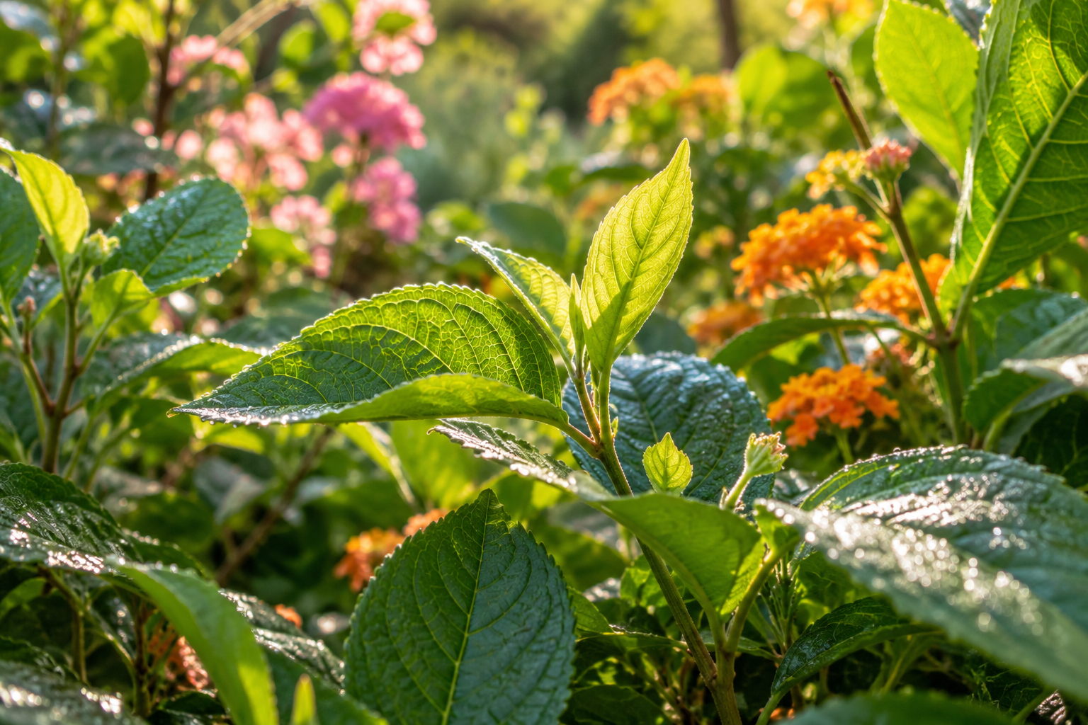
Green Makes Me Think About Everything Still Growing
My garden gets involved pretty quickly whenever I start thinking about green. I associate it with leaves, seedlings and the possibility that something I planted might actually decide to cooperate. I also know how easy it is to attach hope to a tiny amount of new growth, which is a lot of responsibility to give a leaf.
There's an interesting research idea alongside that personal connection. Psychologists Stephen Palmer and Karen Schloss proposed an ecological valence theory of color preference, with preferences connected to how we feel about objects associated with a color. Their experiments supported a relationship between color preferences and responses to color-associated objects. That's a theory about liking colors, rather than a complete explanation of our emotional lives, but it gives me a useful way to think about why my own experiences might follow a color around.
For my palette, green can hold both hope and that uncomfortable feeling of comparing my progress with somebody else's. Envy is an association we already give it in English, while growth is the one I find myself reaching for. A fresh green leaf and a green patch on forgotten leftovers would also prompt rather different reactions. Context apparently gets a vote, even when I'd prefer to keep talking about the garden.
Blue Has Room for Several Different Feelings
English gives us “feeling blue” for sadness, but research also connects blue with pleasant, lower-arousal feelings. I love that complication because it makes space for the difference between loneliness and relief. A pale blue morning and a deep blue evening can belong to very different emotional pictures, even before we start adding whatever happened during the day.
In my version, blue is the room around a feeling. Sometimes I would use it for sadness, and sometimes for the relief of finally understanding what was bothering me. The shade would matter too, along with how much of the page it takes up. A little blue mixed into a hopeful day feels different from a whole page of it, which is probably why one word can feel so inadequate.
Purple Is Where I'd Put the Harder-to-Explain Things
Purple, for me, belongs near awe, tenderness, mystery and the ache that can come with remembering somebody. I like its ability to feel rich and strange at the same time. Lavender and deep violet already suggest different versions of that idea to me, one lighter and more open, the other carrying a little more weight.
These are personal associations, and I want to keep them that way. Somebody else might see purple and think of a favorite flower, a sports team or a childhood bedroom, which would give us a completely different conversation. There's room for grief here if that's the color somebody chooses, just as there's room for delight. The interesting part is the explanation that follows the choice.
Orange Feels Like Something Is About to Happen
Orange is where I'd put anticipation, restlessness and the excitement of an idea that's becoming difficult to ignore. It feels like the point at which thinking about a project turns into opening seventeen tabs about it. Given the number of things I'm interested in, I can appreciate a color with that particular temperament.
Of course, I also love Halloween, so orange has a fairly unfair advantage in my emotional imagination. Pumpkins, changing leaves and October have already given it plenty of good associations. Somebody who connects the same color with road construction might reasonably feel differently, especially while sitting in Philadelphia traffic. Our palettes have been collecting material for years.
Pink Can Hold Tenderness Without Making It Simple
I'd keep pink for affection, openness and the slightly exposed feeling of saying something that matters. The research review found positive associations with pink, while the vulnerability I'm adding is my own interpretation. I like the idea of a color that can hold warmth alongside the uncertainty of letting somebody see it.
There's a difference between feeling cared for and working up the courage to ask for care, even though I'd probably put both somewhere in this part of the palette. One might be a comfortable rose color, while the other could feel much paler and more tentative. Again, it's the distinction I find interesting, the little bit of information that appears when we spend another moment describing what we mean.
Gray Might Be Tired, Heavy or Simply Overcast
Gray is often associated with unpleasant, low-arousal feelings in the research, and I can see why somebody might choose it for heaviness or exhaustion. In my own imagined palette, it could also mean that the edges of the day feel blurred. I think of a feeling that's difficult to separate into its individual parts, with everything arriving as one large, rather unhelpful cloud.
The person choosing gray gets to explain what it means for them. It might describe boredom, sadness, fatigue or a particular memory, and those deserve their own words once we can find them. A color choice gives us a way into that conversation. It leaves a lot still to learn about the person doing the choosing.
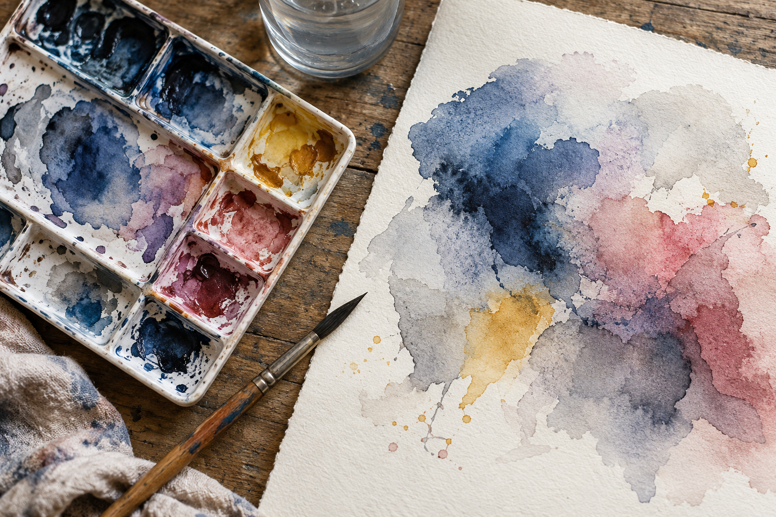
The Feelings That Need More Than One Color
This is the part of the idea I like best, because most of the feelings that interest me seem to come with several things happening at once. Remembering a wonderful day can feel warm and sad together. Starting something new can involve excitement, hope and the sudden realization that you have absolutely no idea what you're doing. I would need a fairly generous palette for that one.
I'd probably describe anticipation as orange with a little yellow around the edges, and a comforting memory as rose with blue running through it. Those combinations are things I'm making up to describe an experience, so somebody else's version can look completely different. There's also room for changing your mind halfway through the explanation. Feelings are allowed to be more complicated than matching a wall color.
The original thought behind this article was that color might help when a feeling is difficult to name, and I still like that thought. I'd let the color start the conversation, then see whether more specific words arrive beside it. A violet day might turn out to mean missing somebody, feeling overwhelmed by something beautiful, or simply wanting a little company.
Maybe the Color Helps Us Find the Words
There is research on naming emotions, although it asks a different question from my color idea. In a 2007 brain-imaging study, labeling emotional material was associated with a reduced amygdala response to negative images compared with other ways of processing them. That was a laboratory task involving emotional images and words. Applying a similar benefit to choosing lavender or teal would be an additional claim, and the study doesn't establish that.
What I'm interested in here is much more ordinary, whether a different way of describing something helps us understand each other. If “fine” is the first answer and “storm-gray with flashes of gold” is the second, I already want to know what the gold is. Maybe it's excitement about a small thing inside a difficult day, or affection that's still there alongside frustration. Either way, there's a person behind the color.
I still think an emotional paint counter would be pretty entertaining, especially the attempt to name the samples. Hopeful but Needs a Nap seems like it would sell well, along with Slightly Overwhelmed and Thinking About the Garden. My curiousity about the whole thing comes back to that space between what we're feeling and what we manage to explain. I'd like to keep a few more colors available for it.
Sources
Jonauskaite and colleagues, 2020. Color-emotion associations across 30 nations.
Jonauskaite and Mohr, 2025. A systematic review of color-emotion research.
Jonauskaite and colleagues, 2019. Color choices following experimentally induced moods.
Palmer and Schloss, 2010. An ecological valence theory of color preference.
Mattingley and colleagues, 2001. Consistent color experiences in grapheme-color synesthesia.
Lieberman and colleagues, 2007. Affect labeling and responses to emotional images.